Google Search Console charts may look overwhelming and result in unnecessary concern when some of the metrics drop.
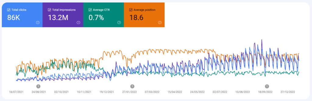
It looks confusing so lets look at impressions vs position.
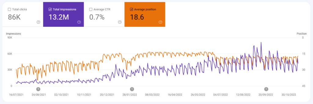
We can see that the lines don’t always move in the same direction. At the beginning both the impressions and positions are growing as the website’s content is being discovered. At this point the average position is around page 3.
In the middle of the chart we can see the average position hit a ceiling on page 2 and starts dropping towards the end of the chart. However the impressions keep growing. A decrease in average position may look like a problem but with the increased impressions this just means that your content is starting to appear under more search queries which dilutes the average position. This should start climbing back up as google works out which queries match your content. You shouldn’t be concerned as long as the clicks/impressions are growing. (And bear in mind the seasonality relevant to your industry)
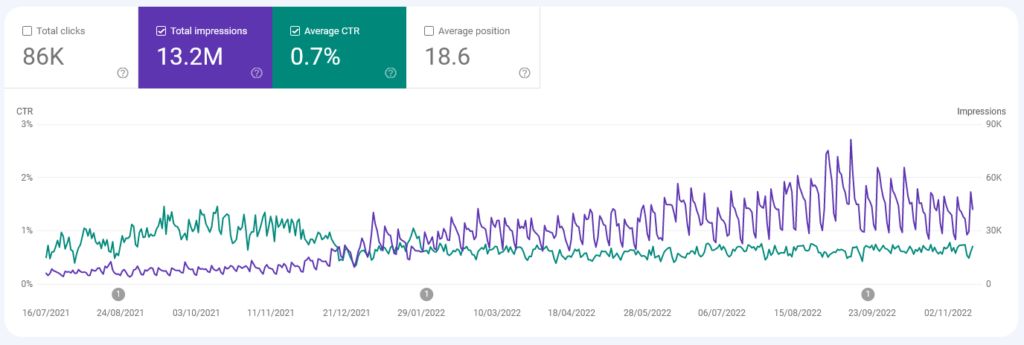
In this chart this is more evident when comparing clickthrough vs impressions. The average CTR clearly dropped and the impressions increased. If your pages show high up for a small number of searches, your average CTR will likely appear to be higher, but as you capture more searches this drops down and it’s good news because you are getting the same traffic as before plus your pages are also starting to show low under new search queries. If you have done a good job with your content, you will see these low down search impressions climb up over time.
If you see a significant drop in all metrics at once, then there may be a problem.